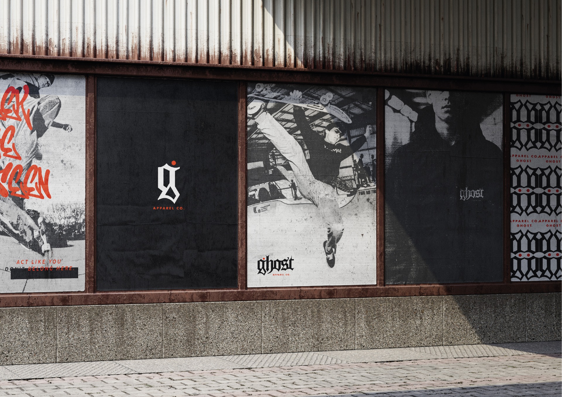
For Ghost Apparel Co., I crafted a visual identity that channels the brand’s dark, underground spirit while remaining clean, cohesive, and instantly recognisable. The custom wordmark began with a gothic-inspired foundation, grounded in the brand’s ties to skate culture, hardcore music, and the occult. From there, I meticulously refined each letterform, sharpening the line work, balancing proportions, and sculpting consistent curves across the tops and bottoms of the characters to create a smooth, unified rhythm.
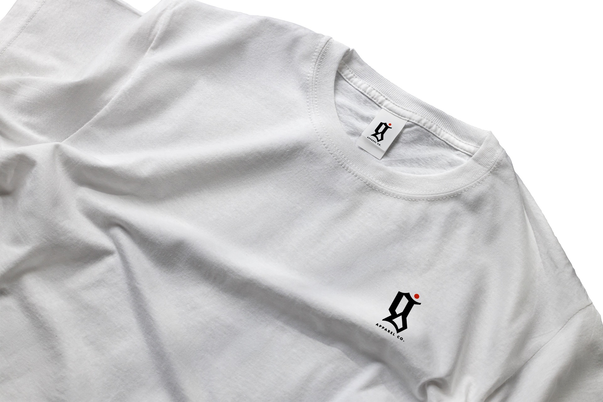
To embody the brand’s ethos of thriving just outside the spotlight, I introduced a small circular accent. This subtle detail adds an air of mystery and serves as a memorable visual signature. Highlighted in a bold orange, it cuts through the brand’s dark, minimalist palette, ensuring the mark stands out without losing its shadowed tone.
Alongside the primary wordmark, I developed a standalone emblem built from the letter G, distilling the brand’s character into a single, versatile shape.