CLIENT
INFO
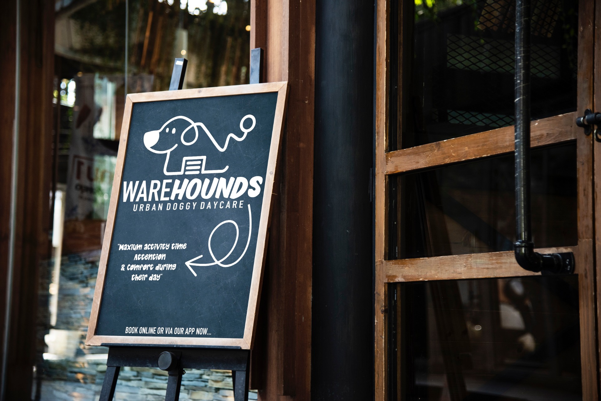
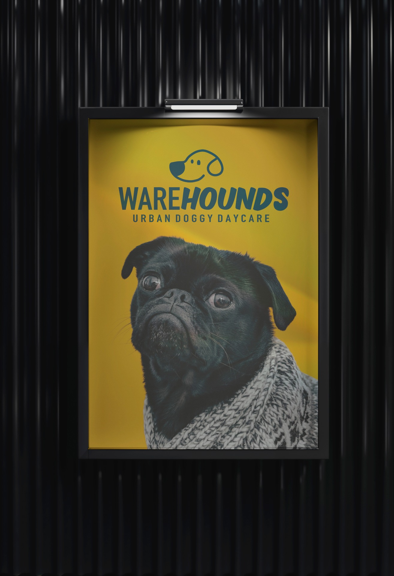
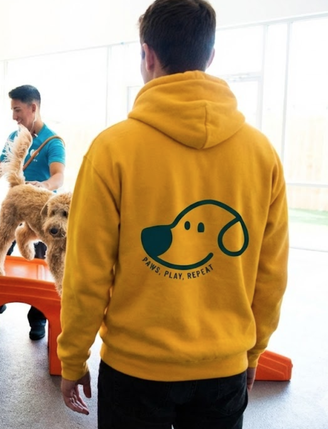
For the Warehounds brand, I set out to create an identity that balanced playfulness with clarity. The primary logo is a bold, single-line illustration of a dog whose body seamlessly transforms into a warehouse, tying together the name and the purpose of the business in a fun, memorable way. The line continues into a dog lead, adding movement and personality while reinforcing the care-centred nature of the brand. For the typography, I paired a serif typeface for “Ware,” giving it a sense of structure and reliability, with a smoother, softer-edged font for “hounds” to bring warmth and approachability. This contrast mirrors the brand’s blend of professional care and playful energy.
Warehounds
LOCATION
Staffordshire, UK
YEAR
2022