eat pretty, cry ugly

UGLY CRY HOT SAUCE

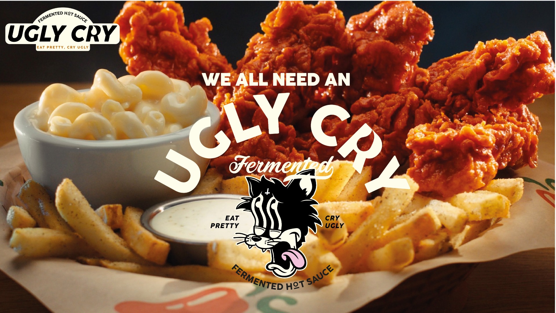
Ugly Cry is a hot sauce brand inspired by vintage cartoons, and the bold, illustrative energy found in modern IPA label design. They wanted a fun, expressive identity that captured the heat and personality behind their sauces. Something playful, punchy, and impossible to ignore. For this project, I developed a wordmark, logo and full visual identity that blends classic cartoon motifs with contemporary illustration styles, resulting in a brand that feels nostalgic, energetic, and full of character.

THE UGLY TRUTH

To tackle the Ugly Cry brief, I started by sketching concepts that blended their inspirations, vintage cartoons, and the bold character seen in modern IPA artwork. Early explorations focused on building a mascot that could carry the brand’s personality, leading to the creation of a vintage-style cartoon cat that captures both the heat and playful energy of the product.
From there, I developed a custom wordmark to pair with the mascot. The letter “R” features a deliberate gap that represents both a tear and a flame, reinforcing the brand name while hinting at the sauce’s intensity.

eat pretty, cry ugly

COLOUR PALETTE

The colour palette leans into the theme of Spice & Heat;  2 shades of burnt orange, paired with an aged white that gives everything a nostalgic, retro-cartoon feel. Together, these elements create a bold, expressive identity that feels fun, memorable, and full of character.